CompuWeb Services
We create stunning, responsive websites that look great on any device and help your business stand out online. From personal portfolios and iOS apps to full e-commerce stores, we design with your goals in mind — blending creativity, functionality, and SEO best practices to attract and convert visitors. Also customer owns the website code.
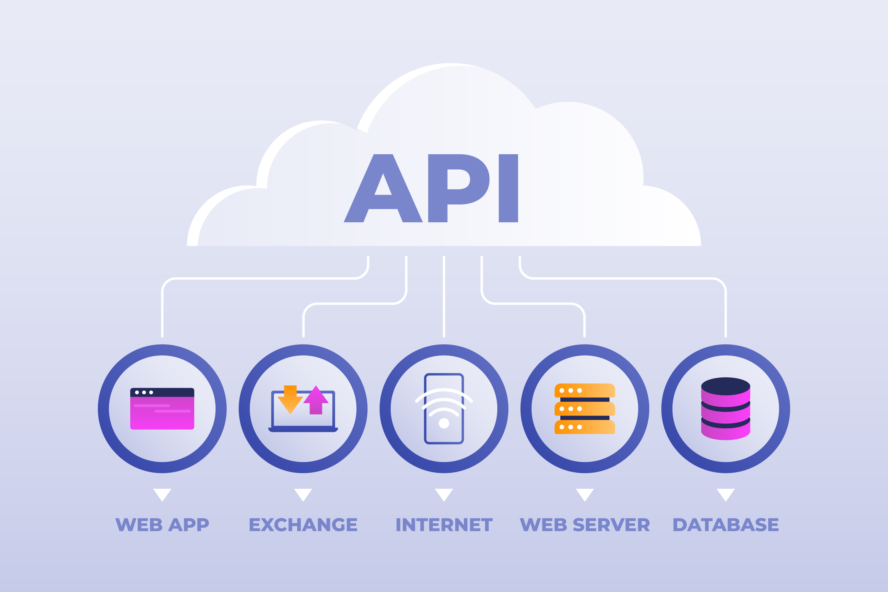
How It Works
FULLY RESPONSIVE
Creating a responsive website ensures it adapts to different screen sizes, providing an optimal user experience. Below are steps to make your website 50% responsive using HTML and CSS. Also Flexible Layouts, Media Queries, Responsive Images and Responsive Typography.
WELL DOCUMENTED
Involves a comprehensive set of practices and documentation that ensure clarity, accessibility, and ease of maintenance such as: Project requirements and scope, Technical documentation, User experience, Security and trust, Content, Aesthetics and functionality. These elements work together to crteate a website that is not only vidually appealing but also user-friendly, secure, and effective in achieving its goals.
EASY TO USE
Involves several key elements that contribute to a positive user experience such as: Clarity and Simplicity, Consistency, User-Friendly Navigation, Fast Loading Speeds, Mobile-Friendly Design, Clear CTAs, Security and Trust, Content and Functionality. These elements work together to create a website that is not just visually appealing but also functional and easy to navigate, ultimately leading to a better user experience and higher conversion rates.
Have a project in mind?
Fill out the form below and we will get back to you with a detailed estimate.


59 Megan Cres, Barrie On
Our Websites and iOS apps are full responsive, well documented and easy to use.
(+1) 705-321-2489